


HEYDAY is a student project created as part of the LUCA (Ghent) micro-credential course in Brand & Packaging Design. The assignment was to design packaging for an ice cream brand. I chose to create a fictional ice cream brand inspired by my childhood memories of the Belgian coast in the 1990s, when I would eat ice cream sandwiches (a scoop of ice cream pressed between two thin waffles) with friends after spending all afternoon playing in the sea and on the sand.
To develop the brand strategy, I conducted a modest study of coastal tourism and the growth of the ice cream industry. The ice cream sandwich is one of the earliest ways of serving ice cream. It was first known as a hokey pokey, a scoop of ice cream served between two pieces of paper. Later, it was developed by Artic as the 'wafelijsje' for Expo58.
I revived this method of serving ice cream amongst the branded, packaged ice cream found in supermarket aisles today. I created an artisan, assorted brand with vintage coastal elements in its visual identity and gave it a classy, festive vibe. Ice cream to make you (re)live your best life, one nostalgic bite at a time.
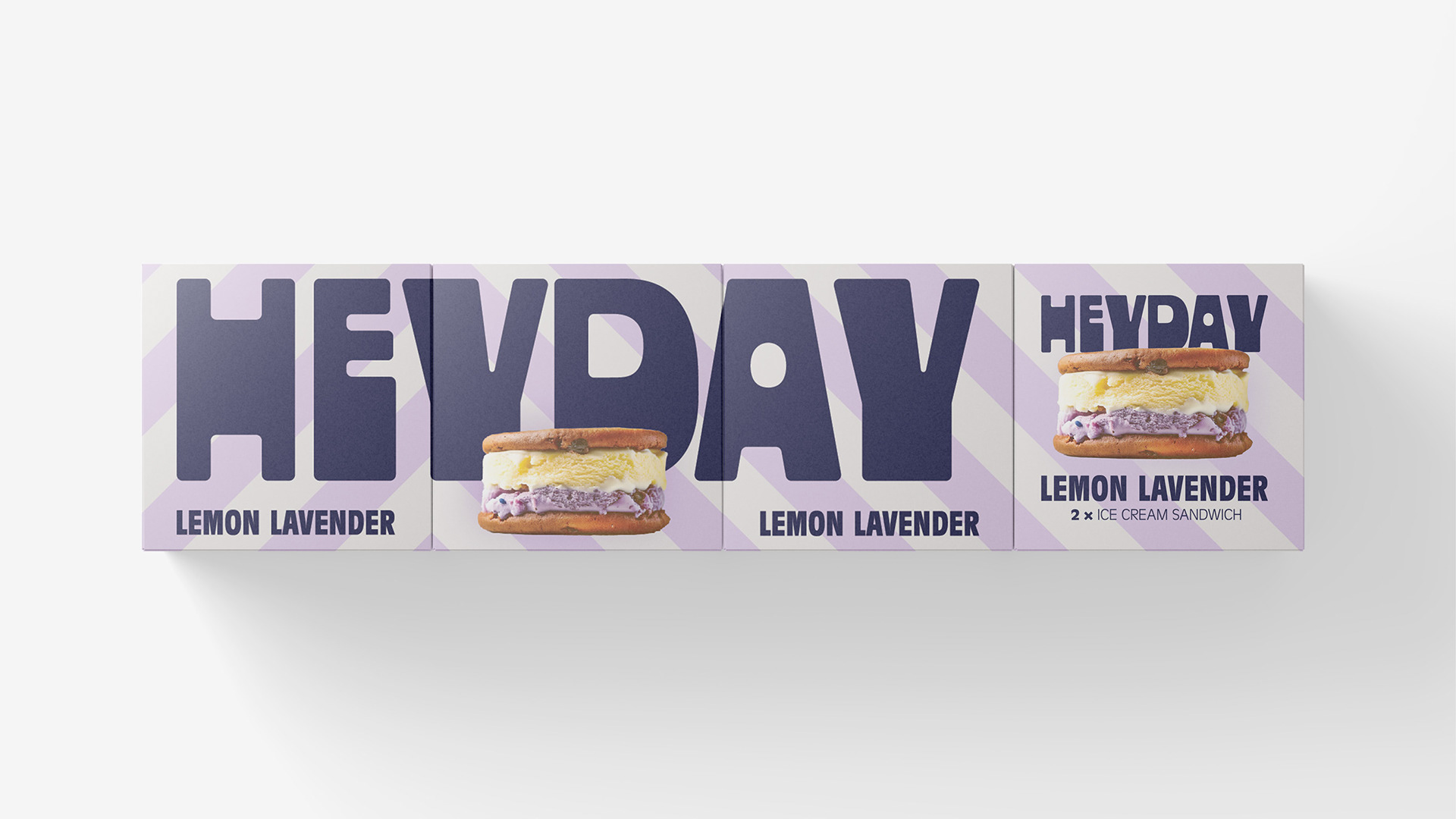
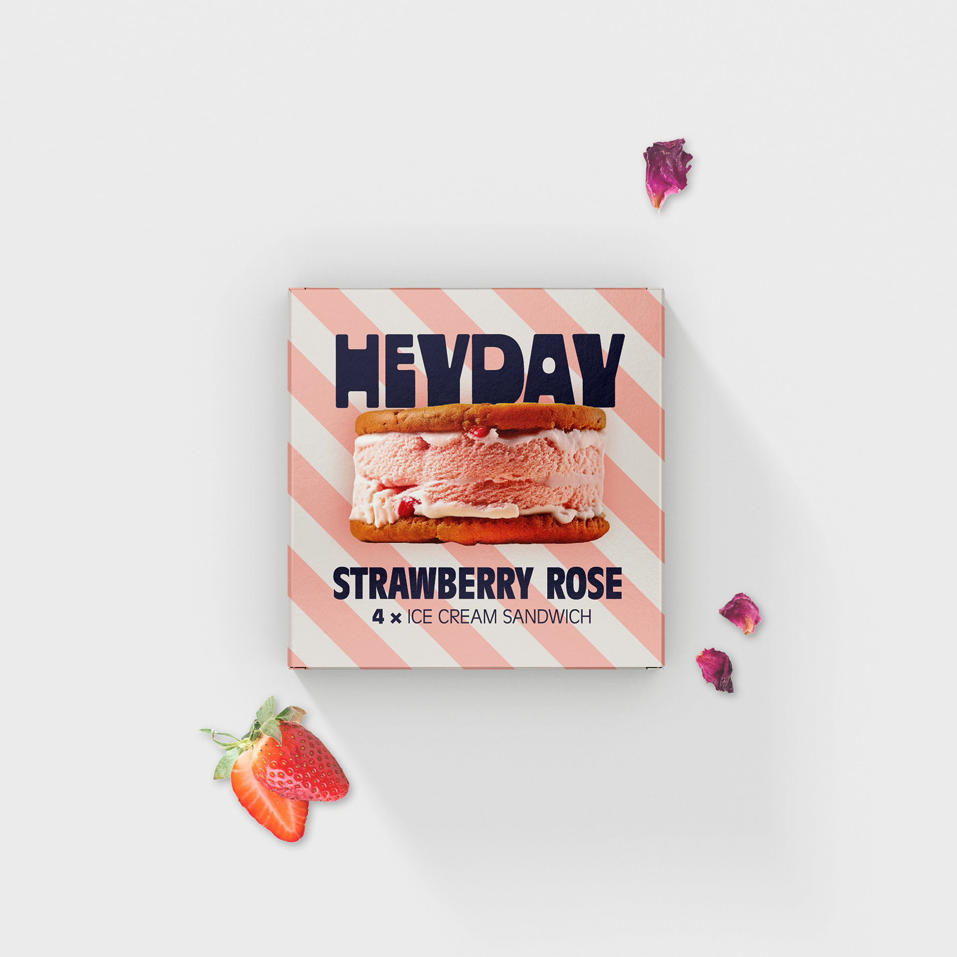
The brand name, HEYDAY, is a direct reference to the exclamation of cheerfulness and surprise that later became synonymous with a 'day in the sun', 'golden years' or 'good old days'. The logo's lettering was hand-drawn based on old posters promoting holidays on the Belgian coast.
Soft pastel colours in a striped pattern were added to basic navy blue and grey (referring to the colour of sand in old black-and-white photographs) to complete the colour palette. A product shot (for this project, created entirely in Photoshop and AI) and an image of the ingredients became important visual elements in the packaging.
Four packaging designs were created. One option was a single sandwich wrapped in striped butter paper and closed with a round sticker; another was two pieces in a square box that could be stacked playfully. There was also a box containing four sandwiches for families, and a box containing eight that could be closed and reopened for storage in a domestic freezer.
This assignment was an exercise in combining the design of functional cardboard packaging with a strong brand identity and eye-catching design.